
The Difference Between Screen Printing, Embroidery and Engraving
The difference between screen printing, embroidery, digital and pad printing, engraving and debossing, plus fixes for...
The difference between screen printing, embroidery, digital and pad printing, engraving and debossing, plus fixes for dark fabric, Pantone and artwork.
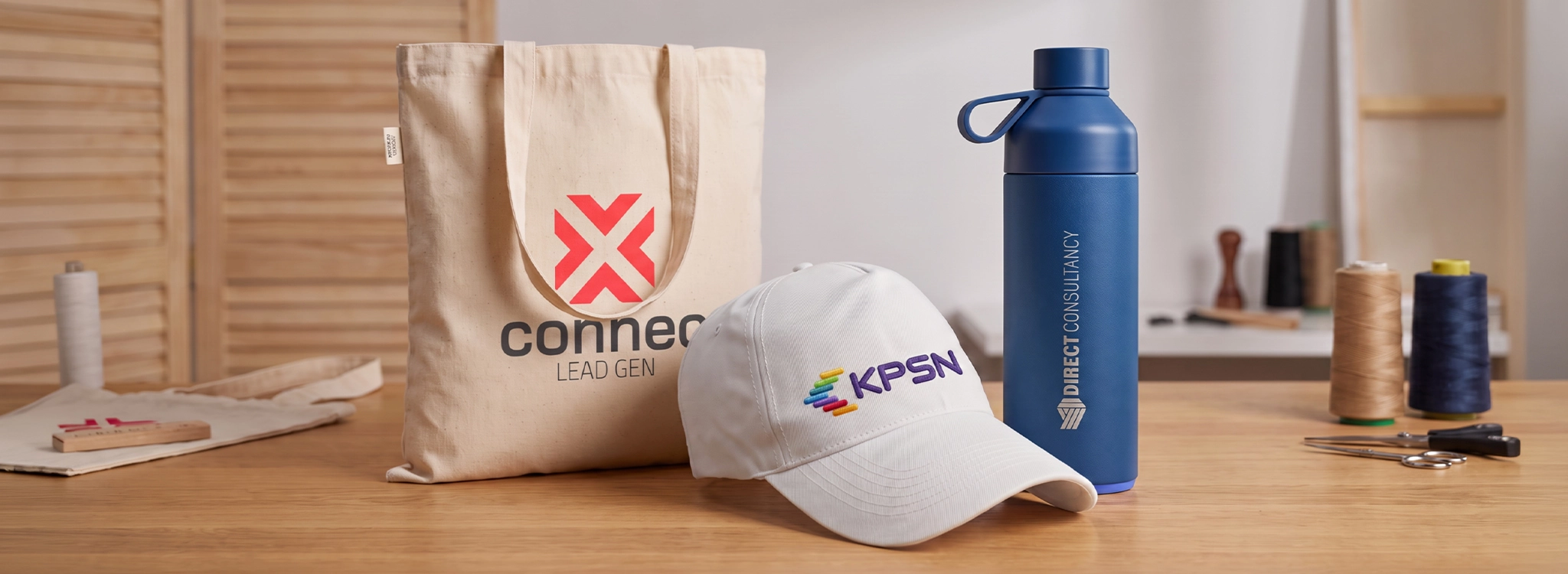

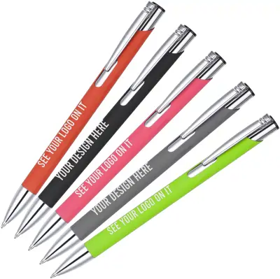

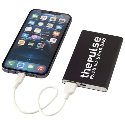

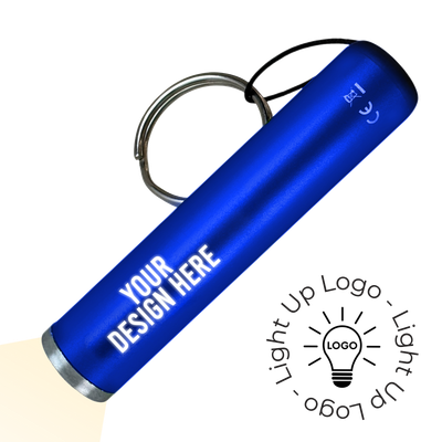
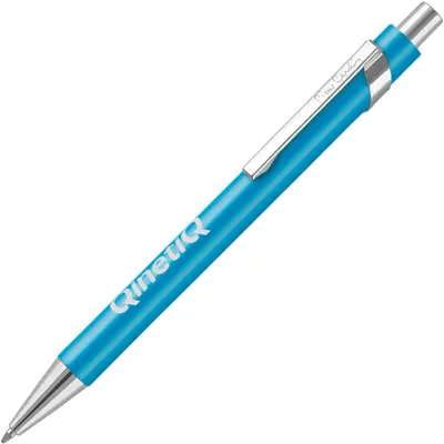
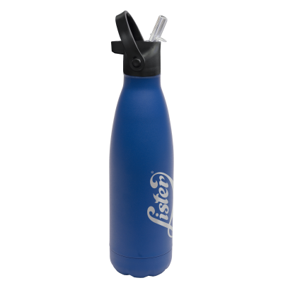


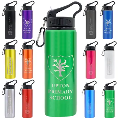
Screen printing pushes ink through a fine mesh onto the product, one colour at a time. Embroidery stitches your logo into fabric with thread. Laser engraving removes a thin layer of the surface to leave a permanent mark with no ink at all. Each suits different products and different logos, so it's worth choosing the method before you choose the product.
This guide explains the main branding methods used on promotional products, what each one is best for, what to do about dark fabric and brand colours, and what artwork each method needs.
What is the difference between screen printing and embroidery?
Screen printing puts a layer of ink on top of the fabric. Embroidery stitches the design into it.
That one difference drives everything else. A screen print is flat and smooth, gives sharp edges and suits bold logos and large designs, such as a print across the back of a t-shirt. It's priced per colour, and the price per item falls quickly as the quantity rises.
Embroidery is raised and textured, and because it's thread rather than ink, it doesn't crack or fade in the wash. It suits smaller logos on polo shirts, caps, fleeces, jackets and bags. It's usually priced on stitch count, so a detailed logo costs more than a simple one, and very fine lines or small text don't stitch well.
As a rule of thumb, embroidery suits a chest logo on workwear that's washed often, and screen printing suits t-shirts, large designs and bigger runs.
Screen printing
How it works. Ink is pushed through a mesh screen onto a flat or gently curved surface, with a separate screen for each colour.
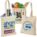
Best for. Tote bags, t-shirts and other flat textiles, as well as some pens and hard items.
Colours. Priced per colour, because each one needs its own screen and its own pass.
Artwork. A vector file in solid spot colours. Gradients and photographs are better suited to digital printing.
When to use it. Bold logos in one or two colours, and larger orders where the cost per item matters.
Digital printing
How it works. The design is printed in full colour, either directly onto the product or onto a transfer that's then applied to it.
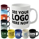
Best for. Mugs, bottles, notebooks, lanyards, and some pens and clothing.
Colours. Full colour in a single process, including gradients and photographs, with no extra cost per colour.
Artwork. A vector file, or a high resolution image at 300dpi at the size it'll print.
When to use it. Logos with lots of colours or gradients, photographic designs and shorter runs.
Pad printing
How it works. A soft silicone pad picks up ink from an etched plate and presses it onto the product, which lets it print onto curved and uneven surfaces.
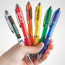
Best for. Pens, keyrings, golf balls and other small curved items. Some pens are pad printed and others are screen printed along the barrel, and each product page says which.
Colours. Priced per colour, like screen printing.
Artwork. A vector file. Simple designs work best, because fine detail can be lost on a small print area.
When to use it. Small items where a clean, precise logo matters.
Embroidery
How it works. Your logo is converted into a stitch file, a step called digitising, and then stitched into the fabric with thread.
Best for. Polo shirts, caps, fleeces, jackets and bags.
Colours. Thread colours are chosen to match your logo. The cost usually depends on stitch count, so detail adds more than colour does.
Artwork. A vector file for digitising. Thin lines and small text don't translate well into thread.
When to use it. Clothing and bags that need a durable, high quality finish, particularly workwear.
Laser engraving
How it works. A laser removes a thin layer of the surface. On coated metal it reveals the bright metal beneath, and on wood, bamboo or leather it leaves a darker tonal mark.
Best for. Metal pens, stainless steel bottles, wooden and bamboo items, leather goods and some tech.
Colours. One tone, with no ink involved.
Artwork. A vector file. Clean, simple logos engrave best, and gradients or photographs can't be engraved.
When to use it. Higher value items where a subtle, permanent mark suits better than a printed logo, including well known names from our brands range.
Debossing and embossing
How it works. Debossing presses the design into a surface to leave an indent. Embossing raises it.
Best for. Notebook covers, leather and faux leather goods, padfolios and packaging.
Colours. A single tone, with no ink.
Artwork. A vector file. Bold, simple shapes give the clearest impression.
When to use it. Notebooks and leather items where a tactile, understated finish suits the brand.
Which method suits which product?
| Method | Best Products | Colours | Premium feel | Cost at volume |
|---|---|---|---|---|
| Screen printing | Bags, clothing, some pens | Priced per colour | Flat and sharp | Low |
| Digital printing | Mugs, bottles, notebooks, lanyards | Full colour | Flat and detailed | Medium |
| Pad printing | Pens and small curved items | Priced per colour | Flat and precise | Low |
| Embroidery | Clothing, caps, bags | Priced on stitch count | Raised and textured | Medium |
| Laser engraving | Metal pens, bottles, wood | One tone | Permanent and subtle | Medium |
| Debossing | Notebooks, leather | One tone | Tactile and understated | Medium |
Why does a logo look wrong on dark fabric, and what can you do?
Because light ink sinks into dark fabric. The fix is a white base layer under the print, or switching to embroidery.
On a dark garment or bag, a light coloured ink lets the fabric show through, so the colour looks dull or patchy. Printing a white underbase first gives the colours on top something bright to sit on. It's an extra pass, so it adds a little to the cost, and it makes the print slightly thicker to the touch. The same applies to coloured tote bags, which our tote bag materials guide covers.
Polyester and poly-cotton garments have a second problem. Dye in the fabric can move into a light ink, so a white print on a red or navy shirt gradually takes on a tint. That's called dye migration, and it's prevented with a print designed to block it rather than a standard one.
Embroidery avoids both problems, because the thread colour is chosen and stays true on any fabric. The limit is detail: fine lines and small text disappear at chest size, in thread or in ink.
Whichever you choose, check the design on the actual garment colour on your Visual Proof™ before you approve it.
What is Pantone matching, and do you need it?
Pantone matching means mixing ink to a numbered colour reference, so your brand colour prints the same way every time. You need it when your logo is screen or pad printed in spot colours, and it matters less for full colour printing, embroidery and engraving.
The Pantone Matching System gives each colour a reference number. A printer mixing a spot colour ink to that reference can reproduce it consistently across products and orders, which is why brand guidelines usually list Pantone references.
The other methods work differently. Full colour printing builds each colour from a small set of inks, so it gets close to a Pantone reference but can't always match it exactly. Embroidery uses the nearest thread shade. Engraving and debossing don't use colour at all.
The product changes the result too. The same ink looks slightly different on natural cotton, white plastic and brushed metal, because the surface underneath affects the colour.
When you request your Visual Proof™, include your Pantone references. We'll match them as closely as the method and the material allow, and the proof shows you the result before anything is made. Colours on a screen vary between devices, so treat the colours on the proof as a guide and rely on the Pantone reference for the match.
What artwork does each method need?
A vector file covers almost everything.
| Method | Artwork | Works best with |
|---|---|---|
| Screen printing | A vector file in spot colours | Bold logos in one or two colours |
| Digital printing | A vector file, or a high resolution image at print size | Full colour logos, gradients and photographs |
| Pad printing | A vector file | Simple logos on small or curved areas |
| Embroidery | A vector file for digitising | Clean logos without fine lines or small text |
| Laser engraving | A vector file | Simple, single tone marks |
| Debossing | A vector file | Bold, simple shapes |
If you only have a JPEG or PNG, upload it anyway. Our in-house designers can often clean it up or redraw it as part of the Visual Proof™ process. Our guide to briefing a promotional products supplier covers artwork files in more detail, and our guide to choosing a pen for your logo shows how a logo's shape affects a small print area.