

Pantone Matching on Branded Merchandise: What It Is and When You Need It
What Pantone matching is, which branding methods it applies to, why one colour looks different on different materials, and what to send with your logo.

Related topics
View allPantone matching means mixing ink to a numbered colour reference, so your brand colour prints consistently on every product and every order. You need it when your logo is screen or pad printed in one or two flat colours. For full colour digital print, embroidery and engraving it matters less. At Hotline, give us your Pantone references when you request your free Visual Proof™, and we'll use the exact codes.
This guide explains what the Pantone system is, which branding methods it applies to, and what to send so your colours come out right.
What is the Pantone Matching System?
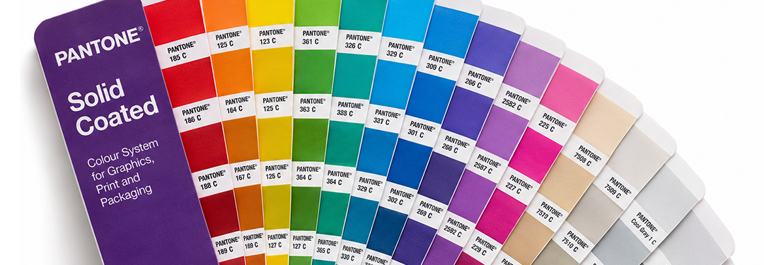
The Pantone Matching System is a standard set of numbered colours used across printing and design, so a colour can be named precisely instead of described. A designer in one country and a printer in another can both look up the same reference and mix the same colour. Pantone explains the system on its own website (correct as at November 2026).
Most brand guidelines list the Pantone references for the logo colours, usually written as a number followed by a letter, such as C for coated paper or U for uncoated.

When do you need Pantone matching?
It depends on the branding method, because each one creates colour differently.
- Screen printing and pad printing: yes. These print one flat colour at a time, so each ink is mixed to your Pantone reference. This is where Pantone matching makes the biggest difference.
- Full colour digital printing: a close match. Digital print builds colours from four inks (cyan, magenta, yellow and black, known as CMYK), so Pantone references are used as a guide.
- Embroidery: thread, not ink. The colour comes from the thread shades chosen for your logo.
- Laser engraving and debossing: no colour at all. Engraving marks the material itself, and debossing presses the design into it.
Our guide to the difference between screen printing, embroidery and engraving covers each method, and how many colours you can print on a promotional pen applies it to pens.
Why does the same colour look different on different products?
The material underneath changes how an ink reads. The same Pantone reference looks slightly warmer on natural cotton, brighter on white plastic, softer on brushed metal and different again on a dark garment, because each surface reflects light in its own way.
That's the nature of printing on real products, and it's why your Pantone reference matters: it's what each print is matched to, so your brand colour stays as consistent as each material allows. Our terms explain that the finished print can look slightly different from a colour reference depending on the material it's printed on. On dark clothing, our guide to logo printing on dark fabric explains how colours are kept bright.

What should you send?
Send your logo as a vector file if you have one, such as a PDF, Adobe Illustrator (.ai), SVG or EPS file with the text outlined, along with your Pantone references and your brand guidelines if you have them.
If you don't have Pantone references, that's fine. Send your logo as it is, and we'll match the print colours to the logo you supply. We can work with high resolution JPEG, PNG, GIF and TIFF files as well as vector files, and our artwork and printing FAQs cover file formats and uploads.
How do you check the colour before you order?
Look at your free Visual Proof™. It clearly states the print colours used, so you can check your Pantone references are there before you approve and buy. Our in-house designers usually send it back in around 20 minutes during working hours, with the price for your quantity and the delivery date.
Screens show colours differently from one device to the next, so use the proof to check the colours listed, the placement and the size, and rely on your Pantone reference for the match itself. You can ask for as many changes as you need. If you'd like to feel a product before a bulk order, some product pages offer a plain sample at a small charge, for checking quality.
| Branding method | Does Pantone matching apply? | What to send |
|---|---|---|
| Screen printing | Yes, each flat colour is mixed to your reference | Vector logo and Pantone references |
| Pad printing | Yes, each flat colour is mixed to your reference | Vector logo and Pantone references |
| Full colour digital printing | Used as a guide, because colours are built from CMYK | Vector or high resolution logo, Pantone references if you have them |
| Embroidery | The colour comes from the thread shades chosen | Vector logo and your brand colours |
| Laser engraving | No colour is printed | Vector logo |
| Debossing | No colour is printed | Vector logo |
To start, choose your product and request a free Visual Proof™ with your Pantone references, and you'll see the colours we'll print before you order.